What The Criterion Collection Taught Me About Design
A few things I've learned as a Criterion fanboy.
Chasing Amy
I remember the first Criterion DVD I bought: Chasing Amy. This was somewhere around the year 2001 or 2001, back when I was collecting DVDs like baseball cards. Or, for you younger folk, like Pokémon cards. I had already built up a decent collection, so DVDs were nothing new to me. But there was something different about this one.
First, on the front cover it read, “The Criterion Collection”. Now, I was used to seeing all kinds of things on DVD packaging: Special Edition, Collector’s Edition, Unrated Edition, etc., but I wasn’t familiar with this nomenclature: “The Criterion Collection”. Okay, whatever.
The next thing I noticed was the spine; it was numbered. Huh. Now that peaked my interest (and to this day I think it’s the smartest packaging decision Criterion ever made). It appealed to the collector in me.
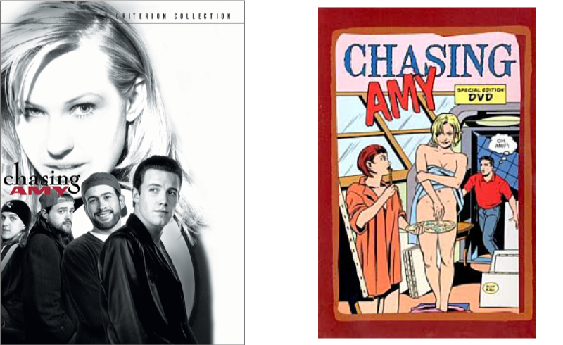
But the thing that really stood out to me was the insert. Most movies come with a flimsy one-piece foldover with a repeated cover image, a few details about the film (maybe), and a list of disc chapters. This disc came with a booklet that was made to look like a comic book (which was appropriate for the film) and, in addition to the usual stuff, included a note from the director and a guide to the characters.
All in all, Criterion’s packaging for Chasing Amy is pretty modest. In fact, in comparison to most of the titles in the Criterion Collection, I would say Chasing Amy is one of the least notable treatments. And yet it still stands out against the vast majority of DVD packaging out there.
All that to say, since picking up that first disc, I have been a fan of the folks at Criterion. They have opened my eyes to a number of films I might have otherwise not discovered, like For All Mankind or House, and they have created definitive versions of some of my favorite films, like Days of Heaven and Paths of Glory. They even introduced me to my new favorite director, Akira Kurosawa. What’s more, they’ve taught me some important things about design.
3 Fundamentals of Design Exhibited by The Criterion Collection
Passion
Criterion is peerless in their dedication to the films they distribute.
As a designer, or really in any field, it is important to be passionate about what you do. Passion not only keeps us from becoming semi-comatose clock watchers, it drives us to be the best we can be and find fulfillment in our work. And for many, it is the key to success.
Collaboration
Criterion works with filmmakers to produce a home viewing experience that is unparalleled.
Two (or more) heads are better than one; it’s really as simple as that. Collaborating with others helps us find solutions to complex problems. In design, more perspectives means a better end product.
Simplicity
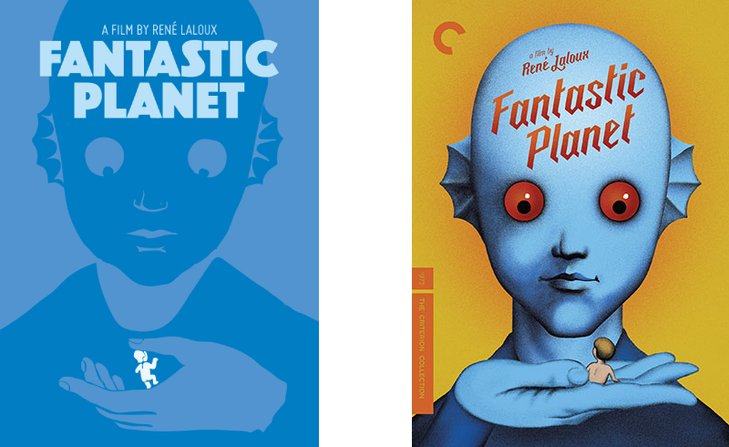
Criterion has mastered the art of simmering the feeling of a film to one image that makes you want to pick it up and watch it, regardless of the film or genre.
The act of simplification isn’t just about aesthetic; it’s about getting rid of everything that doesn’t matter so you can deliver a clear message.
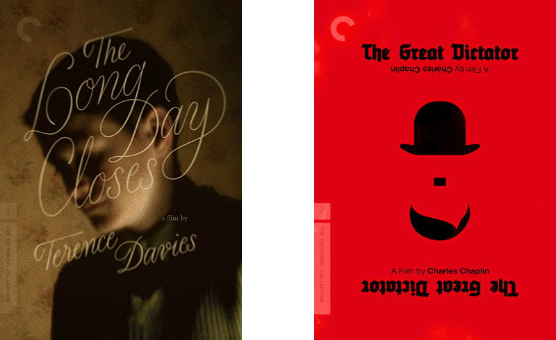
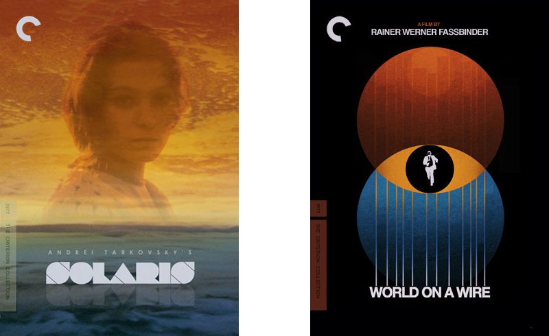
Criterion Cover Art
As a designer, my favorite aspect of any Criterion release has always been the cover. Over the years I have spent quite a bit of time appreciating Criterion cover art. They have worked with some of my favorite designers, like Sam Smith, Jessica Hische, and Olly Moss. I will confess that I am a hoarder of Criterion cover images. That’s right. Judge if you will. But whenever they announce new titles, the first thing I do is download the cover image, to be used later for inspiration. I’m not really a mood board kind of person, but if I were, all of my mood boards would include at least a few Criterion covers.
For years I have had a dream of designing a cover for the Criterion Collection. At some point I started creating cover art for titles I would like to see in the collection, and for a time I joined an online community of people making and posting “fake Criterion covers”. It was a fun little hobby, and it taught me some things about design research. Boiling the essence of a motion picture down to one memorable, eye-catching image is both a science and an art form. Looking back at some of the covers I’ve made, some were more successful than others in that goal. That’s what side projects are for, though: having fun, experimenting, and learning new things.
In 2012, just for fun, I even made a website, based on Criterion’s series of “Three Reasons” videos, stating three reasons why I wanted to design for them, and showcasing a handful of sample covers I had designed. Nothing ever came of it, of course, but I enjoyed daydreaming about the prospect.
In Summary
Being a fan of The Criterion Collection has taught me a lot about film and a few things about design. Moreover, over the years I have come to realize that lessons about design (and life, in general) can be extrapolated from all kinds of hobbies, interests, and situations; you just have to keep your eyes open.
Recent Posts
- My First Three Months at CROmetrics
- What The Criterion Collection Taught Me About Design
- Dear Startups, Stop Asking People to Work for Free
- Community
- CSS Crash Course
- Daily UI
- Simple Dynamic Navigation in Jekyll
- Designing for Mobile
- Prototyping
- Hackathon
- Personas
- CSS Zen Garden
- Accessibility
- Type Study
- A New Adventure
- Avoiding Jargon
- Fail Forward