Earnest

Loan Application

Visual Design + Optimization

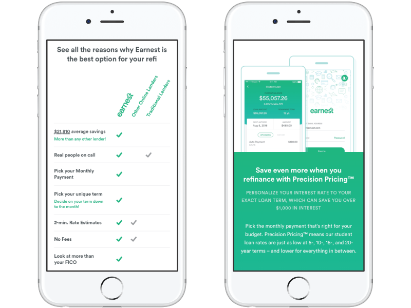
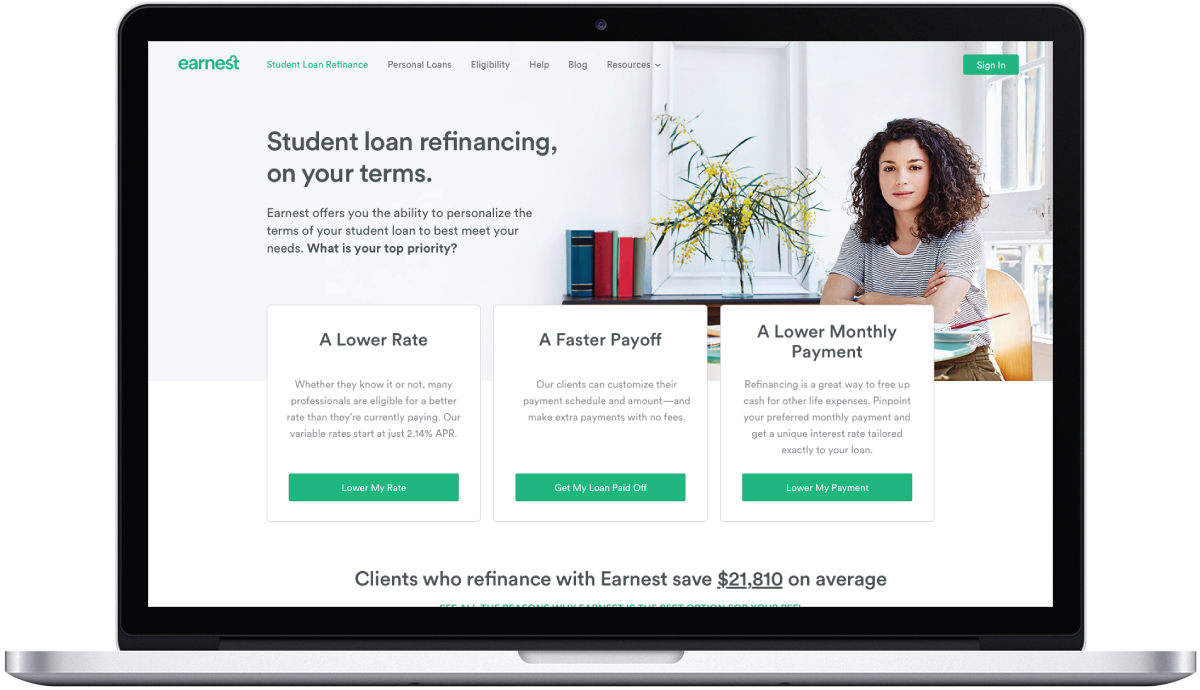
Earnest is a technology-enabled lender offering low-interest personal loans and student loan refinancing. They use a more holistic approach to lending, looking beyond a traditional credit score to obtain a complete financial profile for each applicant. While working at CROmetrics, I helped them optimize the loan application experience to achieve higher conversion rates.

Homepage with Multiple Value Props

Challenge

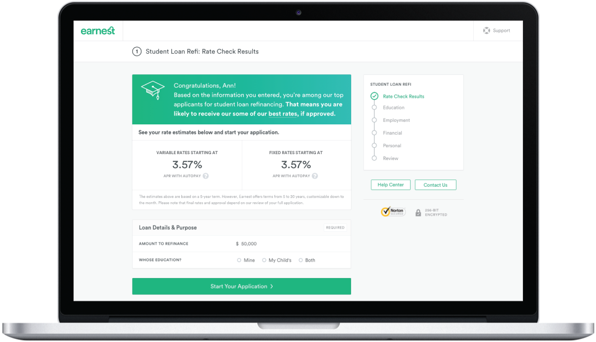
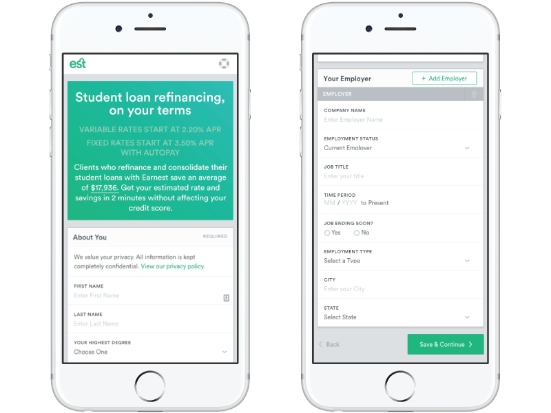
Designing finance applications can be a tricky task. Providing enough information to educate people without overwhelming them with a lot of text and numbers isn’t easy. In addition, no one likes filling out online forms. But getting people approved for loans without some kind of form is pretty much impossible. The biggest challenge with this project was making sure to set the bar high enough. I wanted the end product to not just be less painful. I wanted it to be pleasurable.

Making Information Easier to Digest

Research

I spent a good deal of time researching best practices for designing forms, especially for mobile. I read and watched a lot of Luke Wroblewski’s thoughts on the subject. I performed thorough competitive analysis to see what other lenders were doing. There’s a lot of competition, but most of it doesn’t seem too reputable. Mostly I learned what not to do.

Color Accents & Illustrations Add Character

Solution

When you’re talking about money, the best approach is to be as accessible and transparent as possible. That’s what Earnest does. They focus on benefits without over-promising. They don’t advertise “money in your account today”. They don’t use images of people holding fistfuls of hundred dollar bills. They don’t necessarily offer an easier or faster process. They offer a better process.

When making design decisions, I focused on building trust. Clear hierarchy of information to help people focus on the right things and digest what’s being presented. Lots of white space so as not overwhelm people with too much text on the screen. Color accents to lighten the mood. Real people, not stock images. A mobile first approach.

Making Forms More Pleasurable

Learnings

One of the things I learned in working with Earnest is that less is not always more. I had always assumed that reducing the number of inputs on a form would increase conversion. It’s one of those tricks you hear all the time. But test results showed that people expect a certain amount of questions when applying for a loan. When the process seems too simple or easy they don’t trust it. So there is a delicate balance between too many questions and too few, in order to create a trustworthy experience.

Next