
Project Summary
- My Role
- Research, Strategy, UX Design, Visual Design
- Timeframe
- 2 months
- Outcome
- Improved dashboard experience for increased engagement
The Challenge
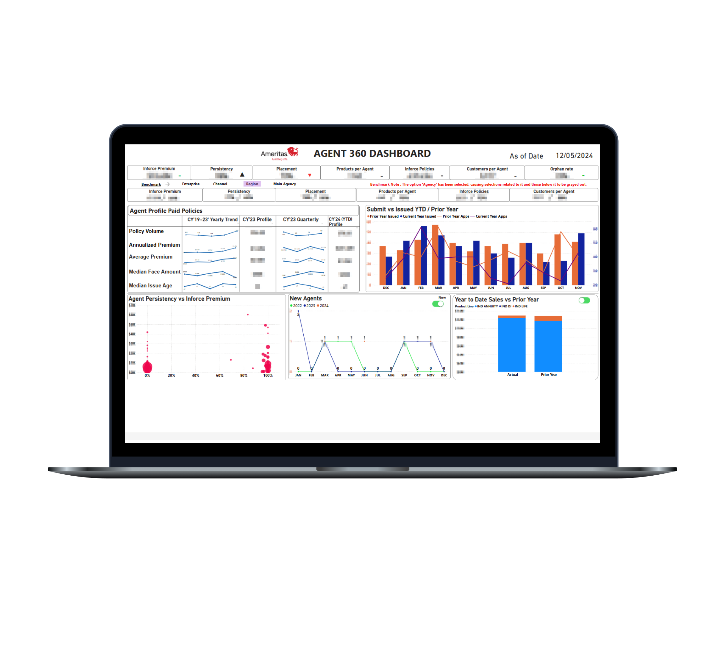
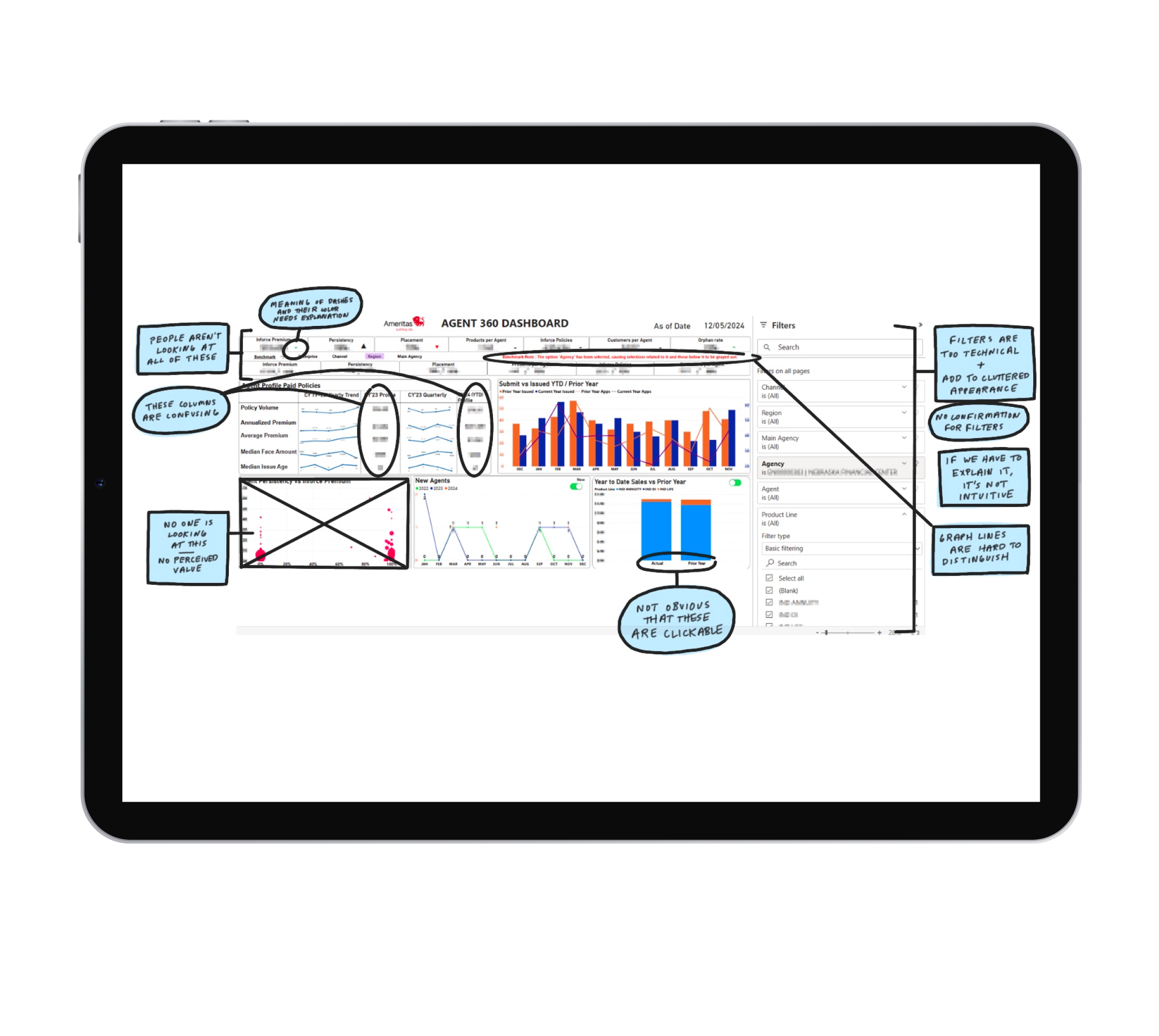
The existing sales dashboard was a complex data dump that failed to provide senior leadership with the clear, actionable insights they needed. This resulted in low adoption and a lack of confidence in making data-driven strategic decisions.
- Problem: Overloaded with unstructured data and difficult to navigate.
- Result: Low usage, with executives unable to quickly find key insights.
- Core Issue: An information architecture and systems problem, not just a visual one.
My Role
As the sole UX designer, I led the end-to-end strategy, research, and design for a new internal sales dashboard. My responsibilities included:
- Defining the user experience from discovery to delivery.
- Translating complex business goals into a structured product.
- Ensuring the final solution was scalable and intuitive for executive users.
The Process
My approach was to move from a data-first to a user-first mindset.
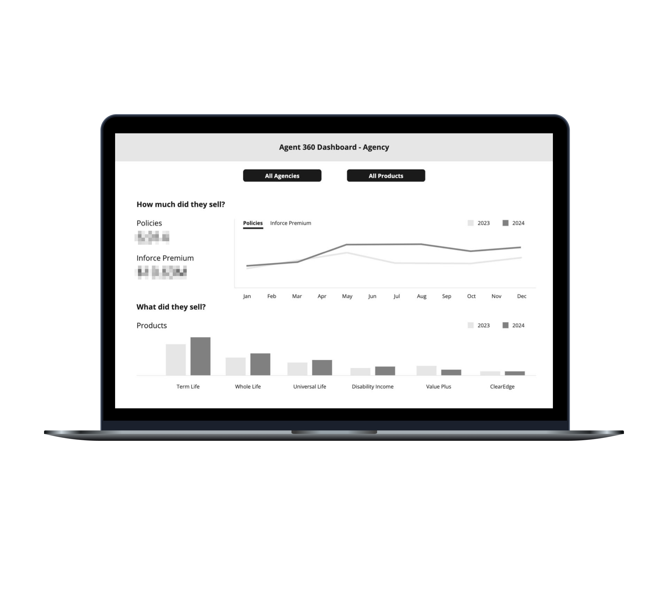
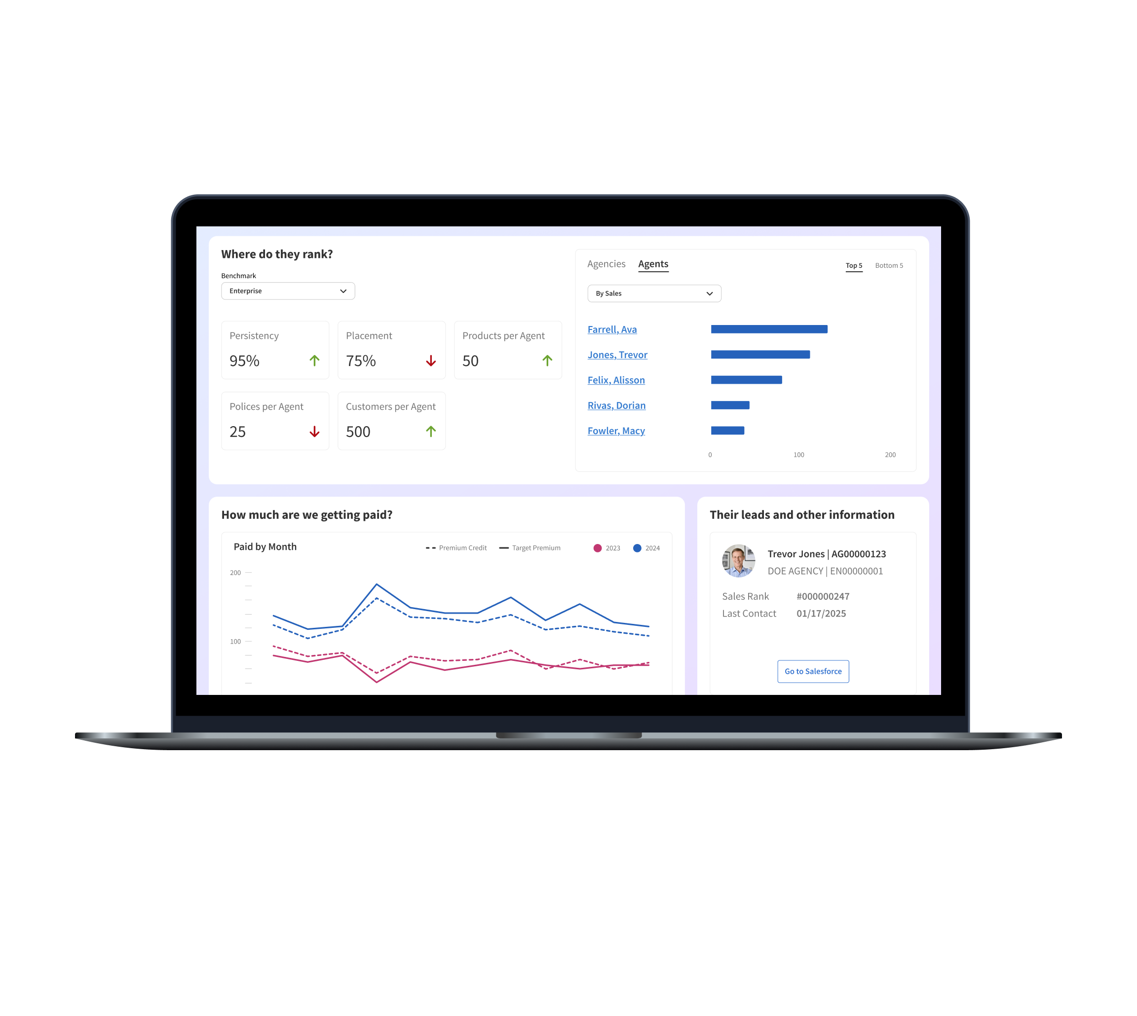
- User Research: Conducted interviews with executives to identify their core business questions, distilling them into a clear narrative: "How much did they sell?", "What did they sell?", and "Where do they rank?".
- Information Architecture: Restructured the dashboard to reflect this storytelling hierarchy, moving from high-level KPIs to granular, drill-down views.
- Systems Thinking: The process of creating this logical, repeatable structure became the foundational template for future data visualization projects.
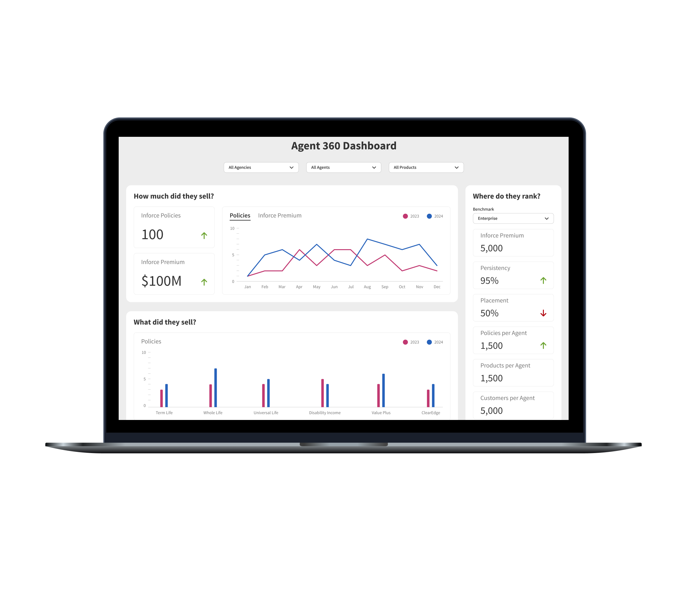
The Solution
The final design was a simplified, visually clear dashboard that made complex data immediately actionable. By prioritizing clarity and a logical flow, the new experience empowered executives to move seamlessly from a high-level overview to specific details.
The Impact
While internal usage metrics were unavailable, the project’s success was measured by a powerful shift in qualitative feedback.
- Before: Executives frequently complained about the dashboard's complexity.
- After: Complaints stopped entirely and were replaced by an influx of new feature requests.
This change demonstrated a profound increase in user engagement and trust, indicating that the new design had successfully solved the core problem and created real value for the business.