Project Summary
- My Role
- UX Design, Visual Design, Testing
- Timeframe
- 2 weeks
- Outcome
- Long-form benefits page for 11% increase in conversion
The Challenge
The Problem: LeanKit, an enterprise kanban application, had an overwhelming amount of valuable content, including features, social proof, and testimonials. The conventional wisdom was to cut content, but this posed a strategic challenge for B2B decision-makers who needed extensive information to evaluate the product.
- Result: A website with high-value content that was not effectively guiding users to a conversion.
- Core Issue: The existing design failed to account for the unique information needs of B2B buyers who required a comprehensive, educational experience to make a purchasing decision.
My Role
I served as the UX and visual designer, responsible for redesigning the benefits page to meet the needs of a highly-specific audience.
- My Contribution: My role was to leverage user research and design best practices to create a long-form page that strategically presented information in an easily digestible, conversion-focused format.
The Process
My approach was to challenge the assumption that "less is more" by designing a long-form experience tailored for decision-makers.
- Research & Personas: I developed personas that recognized the audience's need for detailed information—such as white papers, testimonials, and feature comparisons—to make an informed corporate purchasing decision.
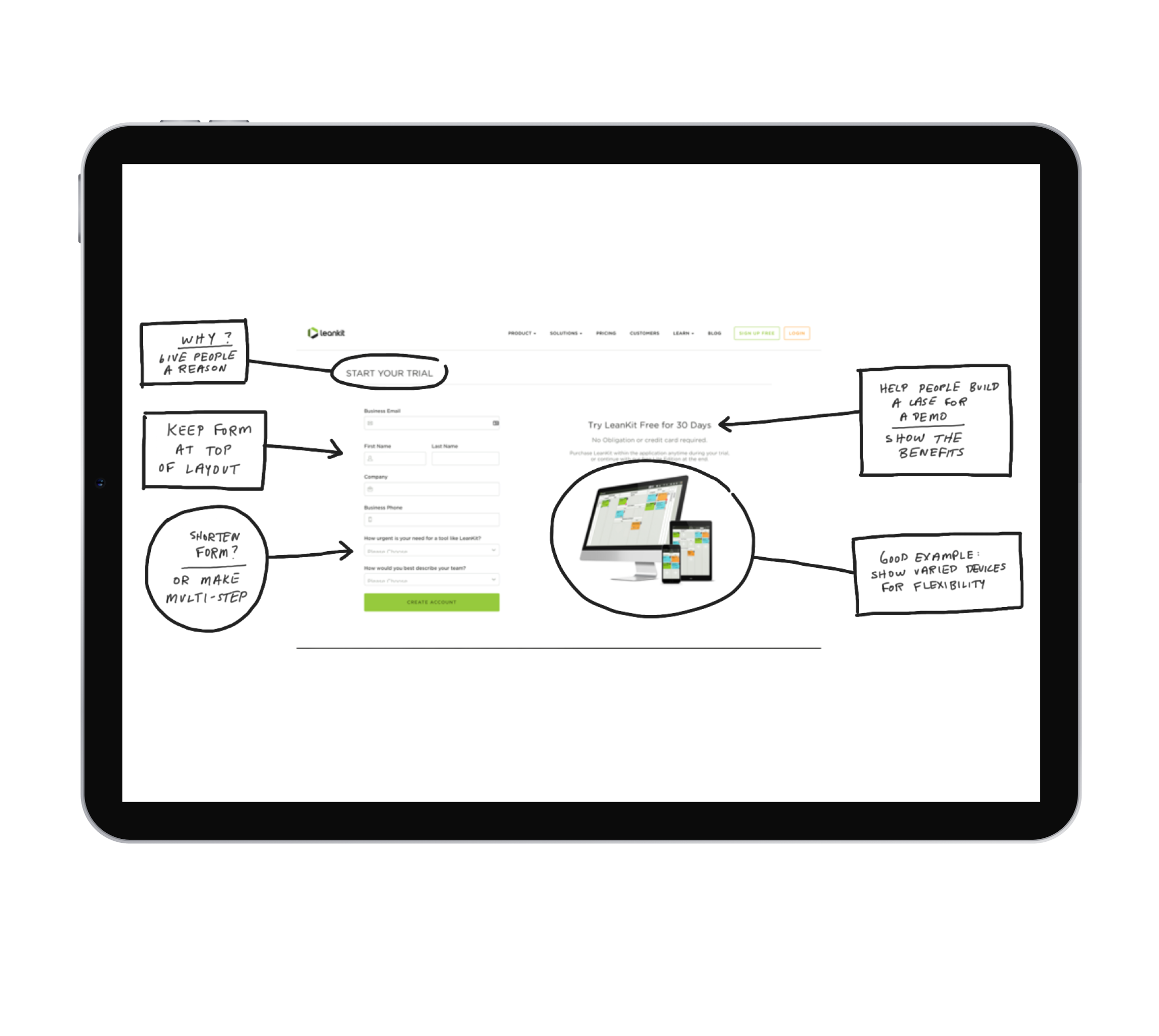
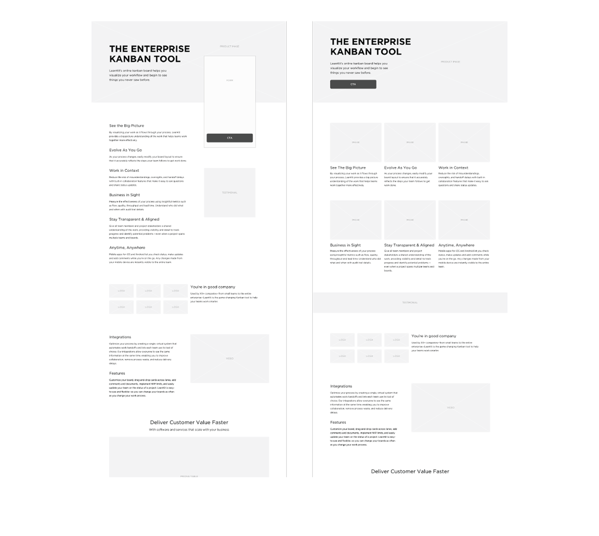
- Information Architecture: I focused on breaking up the content into easily digestible, scannable sections, ensuring a clear information hierarchy.
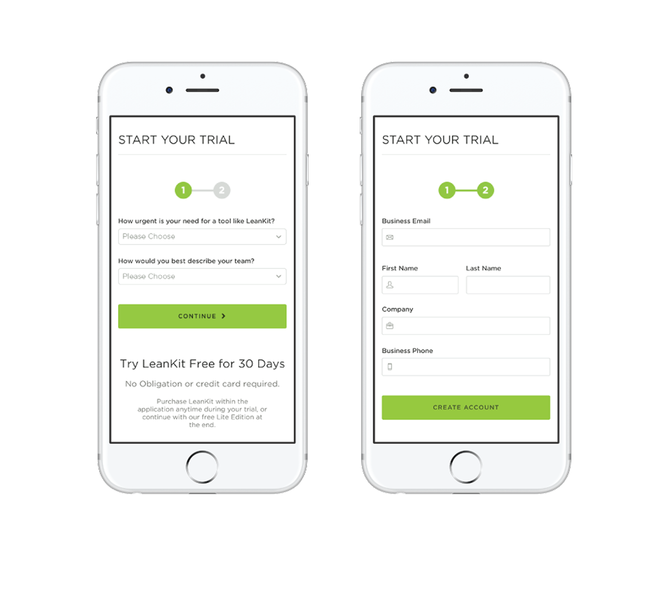
- Mobile-First Design: I applied a mobile-first approach and designed a responsive layout that would function effectively on various devices, ensuring a seamless experience for all users.
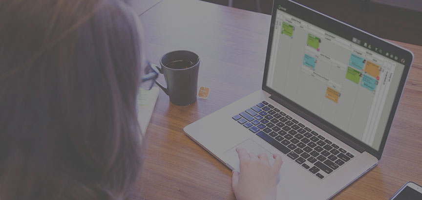
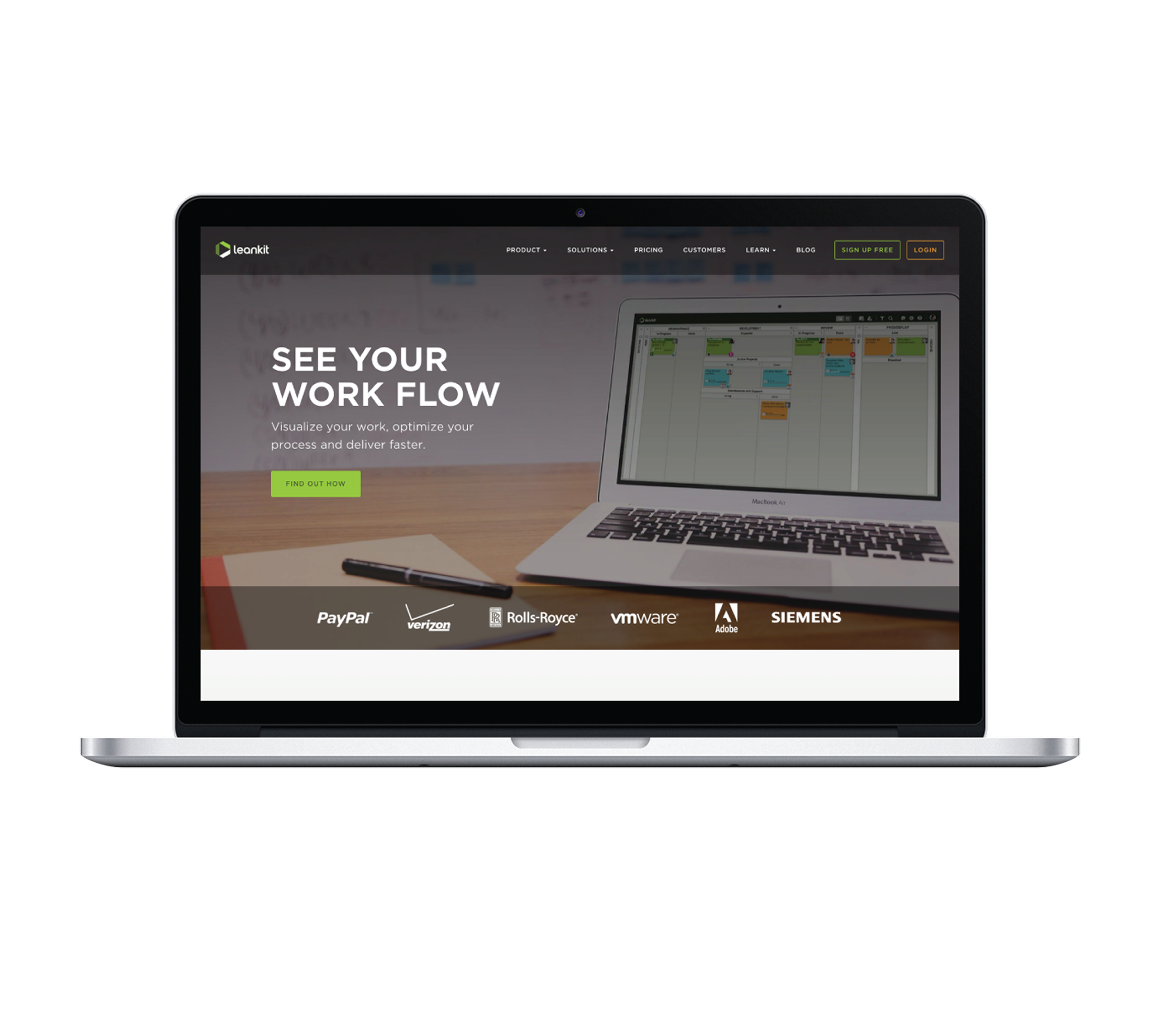
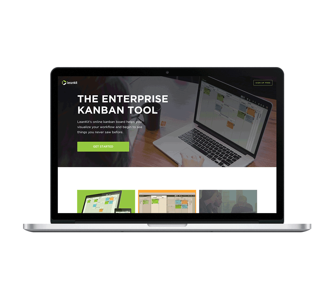
- Strategic Imagery: I used product imagery to build trust and show the application in use, directly addressing the user's desire to compare features and understand the product's functionality.
The Solution
I designed a long-form benefits page that provided a comprehensive, educational experience. The solution featured a pricing comparison table, clear visual cues, and a mobile-first layout. By presenting all the necessary information in a logical, structured way, the design supported the user's decision-making process rather than overwhelming them.
The Impact
This project successfully demonstrated that a long-form, educational approach was the right strategy for this audience.
- The Result: The redesigned benefits page produced an 11% increase in conversion, validating the hypothesis that providing more information in a well-organized format can be a powerful conversion driver.