CSS Zen Garden
In the world of web design, the CSS Zen Garden is kind of a big deal.
Project Details
This past weekend I had an assignment, for my course at The Iron Yard, to create a CSS Zen Garden. If you’ve never heard of it, The CSS Zen Garden is a challenge put forth by Dave Shea to create a unique website design using purely CSS. Everyone who participates in the challenge uses the same HTML file, which is not to be edited. The goal of the project is to show what can be done using only CSS.
The CSS Zen Garden has been around for more than a decade, and has become a rite of passage for web designers. Anyone can submit a design, and those that are deemed worthy get the honor of being featured in the CSS Zen Garden archives alongside hosts of notable designers, and of course all the fame and recognition that entails (mainly high fives at dribbble meetups). All that to say, in the world of web design, the CSS Zen Garden is kind of a big deal.
Project Requirements
We were given three days to create a stylesheet, and each student was assigned an art movement to use as a basis for their work. Additionally, we were given a few basic requirements. Our design was to include:
- One :before element
- One :after element
- One CSS animation
- Two breakpoints
My Approach
Some of the most popular CSS Zen Garden designs have been created by people I look up to, so this assignment was especially challenging for me. Browsing through the archives, it was hard to imagine I could ever create anything as glorious as what I saw. But I tried to remind myself that from its inception, this was meant to be a learning exercise. Plus it was an assignment for school, so I needed to get on with it.
I was assigned op art as the theme for my work. I had never even heard of it! After some quick googling I learned that op art is mainly optical illusions based on Gestalt theory. Pretty cool, but I had no idea how to translate this into a cohesive design for the web. So I decided to do some more research. I read up on op art and its artists’ goals, looked at a lot of imagery that made my eyes cross and my vision blur. In the end, I decided that the core of op art is tricking the eye into seeing something that’s not there, be it movement, an extra dimension, etc. This gave me a better idea for how to tackle this beast.
Execution
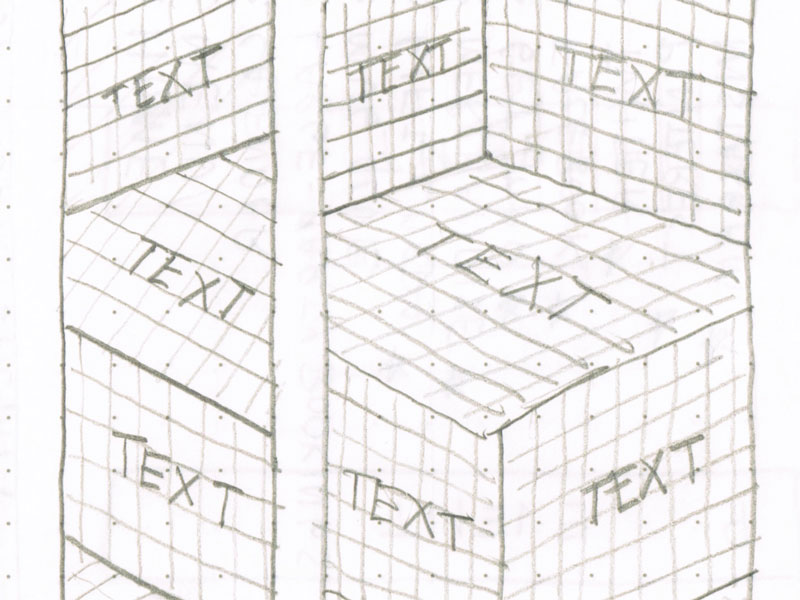
At first I had some pretty big plans for the design. I made some sketches that included 3D text and images, and it looked pretty cool on paper. I was also pretty stubbornly set on not using background images to achieve this effect. I knew that with CSS it is possible to create perspective, and I had a couple strategies in mind.

Unfortunately, those things didn’t work quite the way I thought they did. After a time of scouring the web for an answer to my problem, I came up with no real solution to my problem, so I decided to go another route. I ended up going with a pretty minimal design, trying to balance simple, readable type and a good amount of white space with a few big images of op art. Once finished, I was fairly pleased with what I had created. I think with a few tweaks, I could submit my work with some degree of confidence that it wouldn’t end up on the wall of shame.
In Summary
In terms of my goals for the assignment, I think I was successful. I created a design that is (relatively) visually appealing and easy to get through. Looking back, I could have used background images to create the effect I had originally hoped for. And while that would have been a compromise, I still would have been stretching myself a bit more.
One of the things I love about being at The Iron Yard is seeing my classmates’ work. It’s cool to see how everyone will come up with their own unique solution to a design problem. Seeing other people push themselves to try new things and do more has really inspired me to do the same. I’ve already made a couple revisions to my design that I think make it work better. I want to keep experimenting and pushing the boundaries of what I can do with code. I want to stop being afraid to fail. I want to get all I can out of this program. I can’t afford to play it safe.
Recent Posts
- My First Three Months at CROmetrics
- What The Criterion Collection Taught Me About Design
- Dear Startups, Stop Asking People to Work for Free
- Community
- CSS Crash Course
- Daily UI
- Simple Dynamic Navigation in Jekyll
- Designing for Mobile
- Prototyping
- Hackathon
- Personas
- CSS Zen Garden
- Accessibility
- Type Study
- A New Adventure
- Avoiding Jargon
- Fail Forward
