Benefits Page Improvement
LeanKit
Project Summary
- My Role
- UX Design, Visual Design, Testing
- Timeframe
- 2 weeks
- Outcome
- Long-form benefits page for 11% increase in conversion
Client
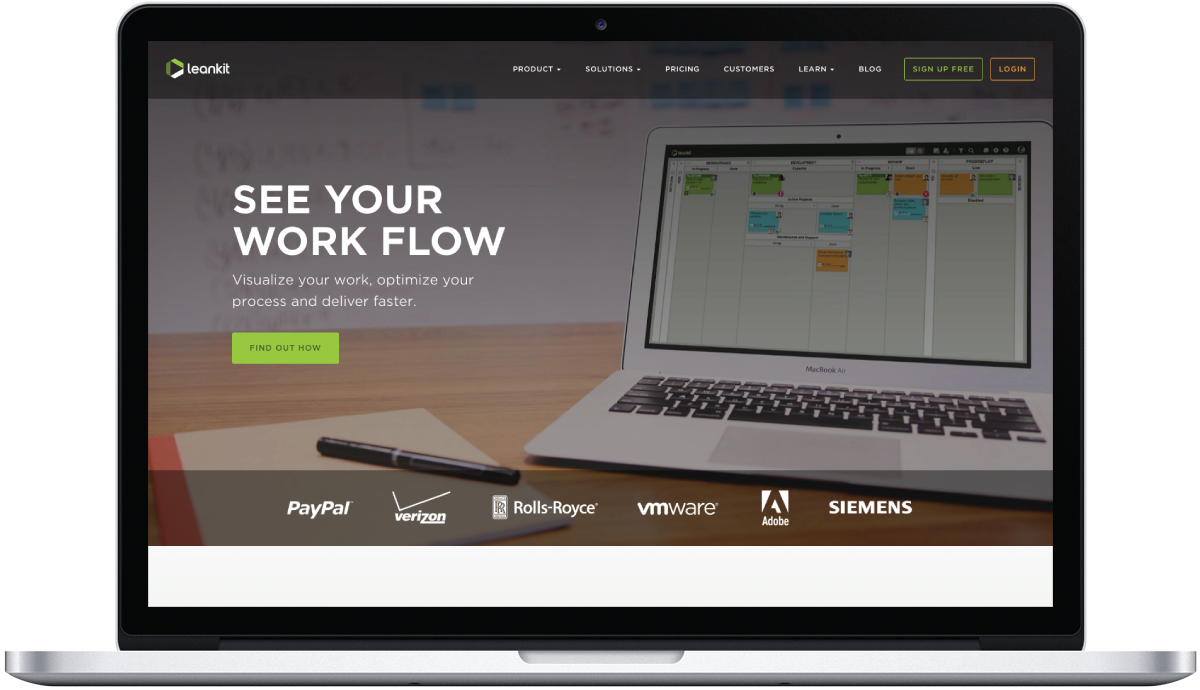
LeanKit is an enterprise kanban application designed for engineers. During my time working at CROmetrics I helped them focus on presenting the benefits of their software in order to guide people through the decision making process and increase conversion.

Challenge
LeanKit has a lot of content. Loads of benefits, knowledge, and social proof. As a designer it’s easy to take a look at a page with lots of content and want to start taking things away. But cutting content isn’t always the best solution.

Research
In addition to competitive analysis and SWOT analysis, I developed some personas that were really useful when designing. One of the things I considered was that most people looking at the LeanKit website are trying to make a decision for their company about which kanban software to use. In order to make an educated decision, they need more than a solid value prop. They need a list of benefits. They need white papers. They need testimonials and reviews. They need specs they can use to compare.

Solution
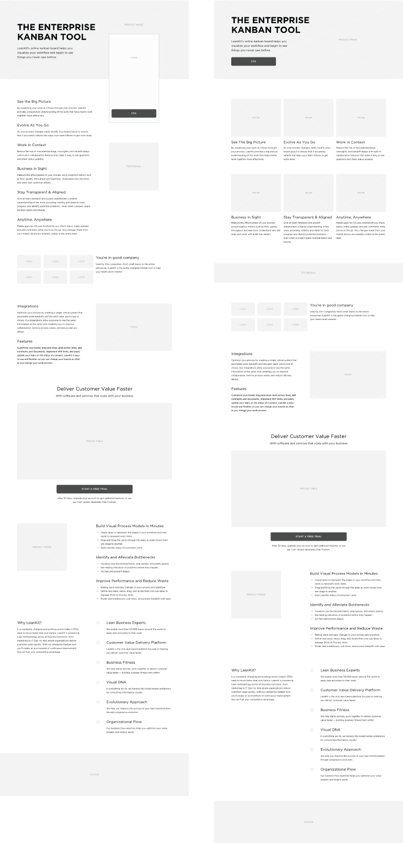
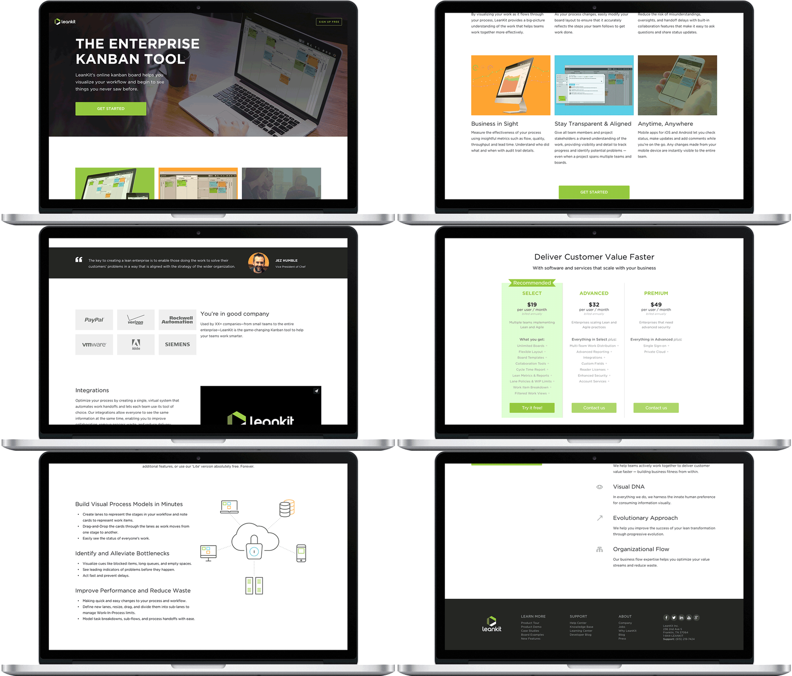
Since there was a lot of content to design for, my goal was to break everything up into easily digestible sections. I used a mobile first approach and experimented with different layouts for mid to large screen sizes. I designed a pricing comparison table for the various plans offered for decision makers to use as a guide.
For imagery, I tried to showcase the application itself. Happy outcome images work well for many websites, but when people on your site are trying to compare your product with someone else’s, they want to see what they’re going to get. I also tried to showcase the app running on various devices to show its flexibility and how easily it can fit into any team’s workflow.

Learnings
Yet again, I learned that there is no sure-fire conversion hack. I had always assumed that long educational pages didn’t convert as well as brief ones with all the key benefits above the fold. Testing proved that providing more information can help people convert better. It just depends on who that person is.