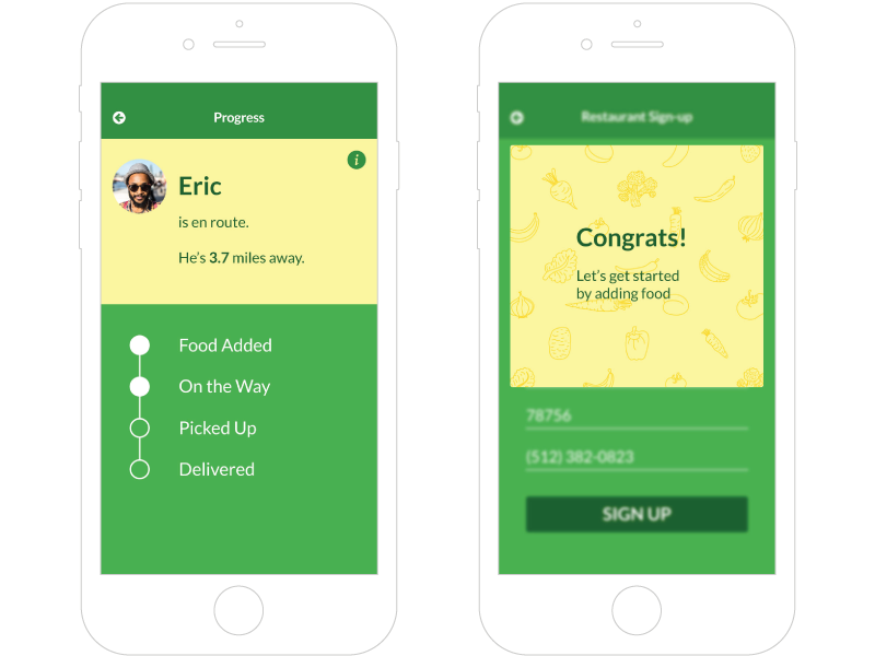
Extras

Revised: Skip to new version
View the InVision prototype

Timeframe: 5 days

Project Description

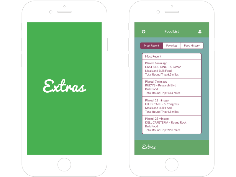
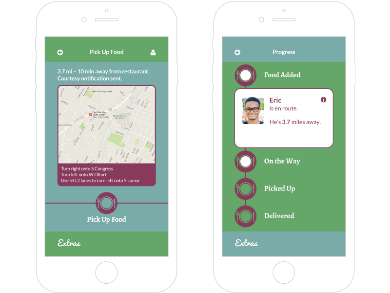
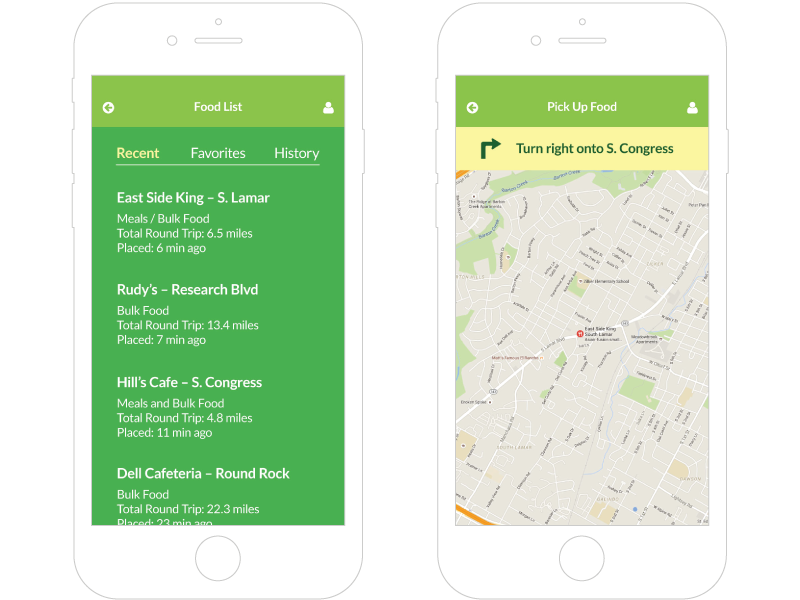
Extras is a native mobile application created to connect restaurants who want to donate extra food with volunteers who can deliver it to people in need. A collaboration between myself and a fellow UI Design student, this was a group project for a practice client (a UI Design alumnus). Our client came to us with an idea for a native mobile app and we designed it.

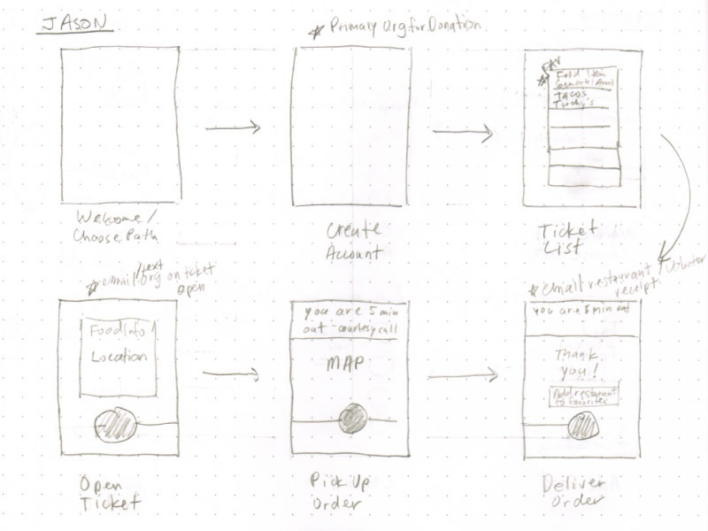
My partner and I met with the client once in person, then scheduled times to check in via Slack to show our progress and get feedback. We worked on the project for a total of five days, at the end of which we presented our product, an InVision prototype, to the client and the rest of our class.

Left: Loading Screen, Right: Food List

User Stories

In addition to creating three separate personas for the project, we came up with a user story for each. These stories represented the unique needs of the personas, and presented design problems that needed solving. This helped inform our decisions about how to design our app.

Cynthia
“As a Cafeteria Manager I want to be able to schedule a food donation pickup quickly and efficiently so I don’t waste my time or resources.”
Phil
“As a Restaurant Owner I want to be able to give back to those in need in my community so I can feel like I’m making a difference with my business.”
Jason
“As a Volunteer I want to be able to know where to pick up food donations and exactly where the drop spots will be so I can give back and do it within a schedule that I always assumed was unforgiving.”
Left: Navigation, Right: Progress

User Flows

After evaluating our personas and their needs, we decided our users fit into two distinct groups: restaurants and volunteers. So we set about creating two separate user flows, to help each group of users complete their task quickly and easily.

For the restaurants, their main goal is to post the extra food they want to donate quickly so they can get back to work, and then be notified when someone is coming to pick it up. The volunteers’ main goal is to easily find food to pick up and deliver to their charity of choice, and be guided to each of their destinations. We designed user flows to guide each group through their task in a minimal number of screens.

User Flows Sketch

Challenges

The biggest challenge on this assignment was working with another designer. Please note: this is not a complaint about my partner, who is very talented and a pleasure to work with. Simply put, I am mostly experienced working by myself. So even though our communication was good and I have faith in the capabilities of the person I was paired with, it was challenging to not have complete creative control.

This is one challenge I welcomed. I realized that wherever I go, the likelihood that I will be working alone, with complete creative control, is pretty low. And realistically, I don't want to be in that kind of situation. Working with another designer, I came to appreciate collaboration and how we can spur one another on to do better work.

Extras Version 2.0

After graduation I decided to revisit this project and make some revisions. I went back to our original research and concluded that the design could benefit from some adjustments regarding sizing, typography, color, and general aesthetic. This new version is a bit more appropriate for the feedback we were seeking.

Focus on Usability

Throughout the revision process, I tried to focus on usability. I made a concerted effort to view every screen of the app through the lens of the user and their needs. Extraneous design elements were removed and content was made larger and more accessible. I also implemented a grid, to better organize content.

Left: Food List, Right: Navigation

Patterns & Delight

I tried to use existing design patterns instead of reinventing the wheel. I also switched to a monochrome color palette and used an accent color to highlight important information.

Lastly, I replaced stock photos with illustrations and added a subtle illustrated background to certain congratulatory screens, for a bit of fun. What's life without a little whimsy?

Left: Progress, Right: Signup Success

Version 2.Alex

These revisions were completed without the help of my partner for the project or input from our client. So in a way, they do not reflect the original purpose of the project, which was to work with another designer, for a client. This is merely how I would have designed it, if it had been a solo project.

Previous Next