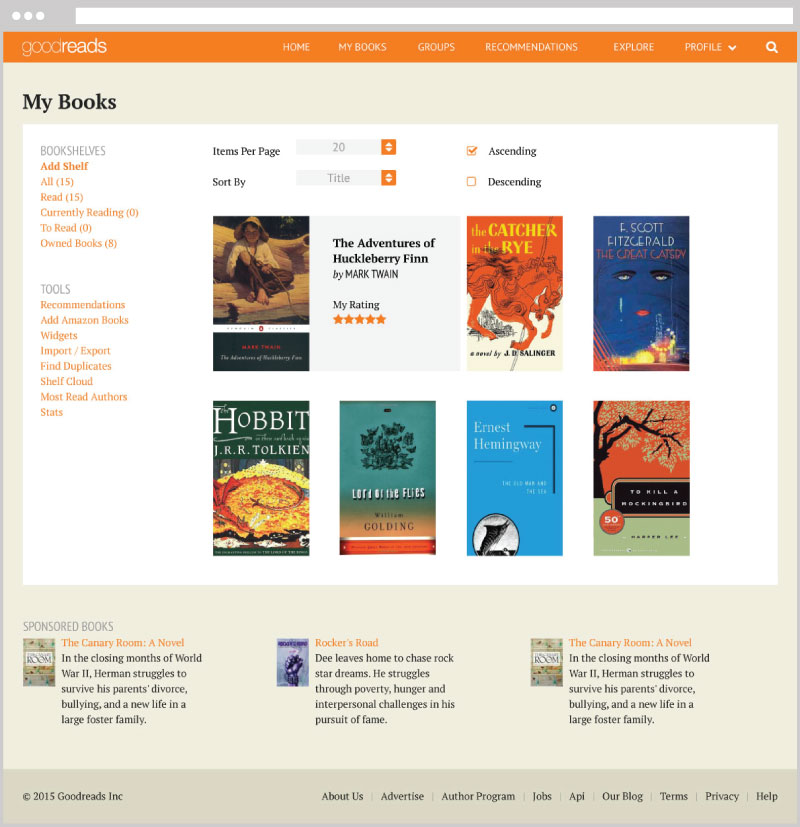
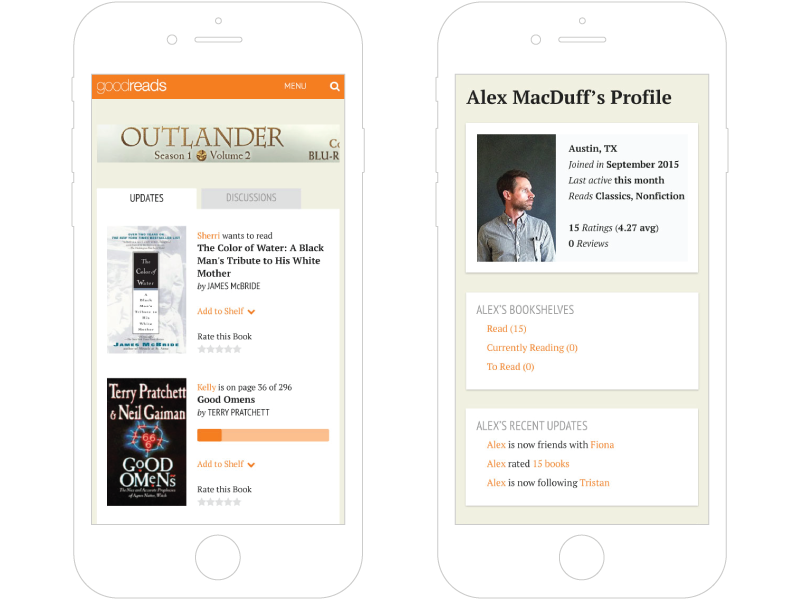
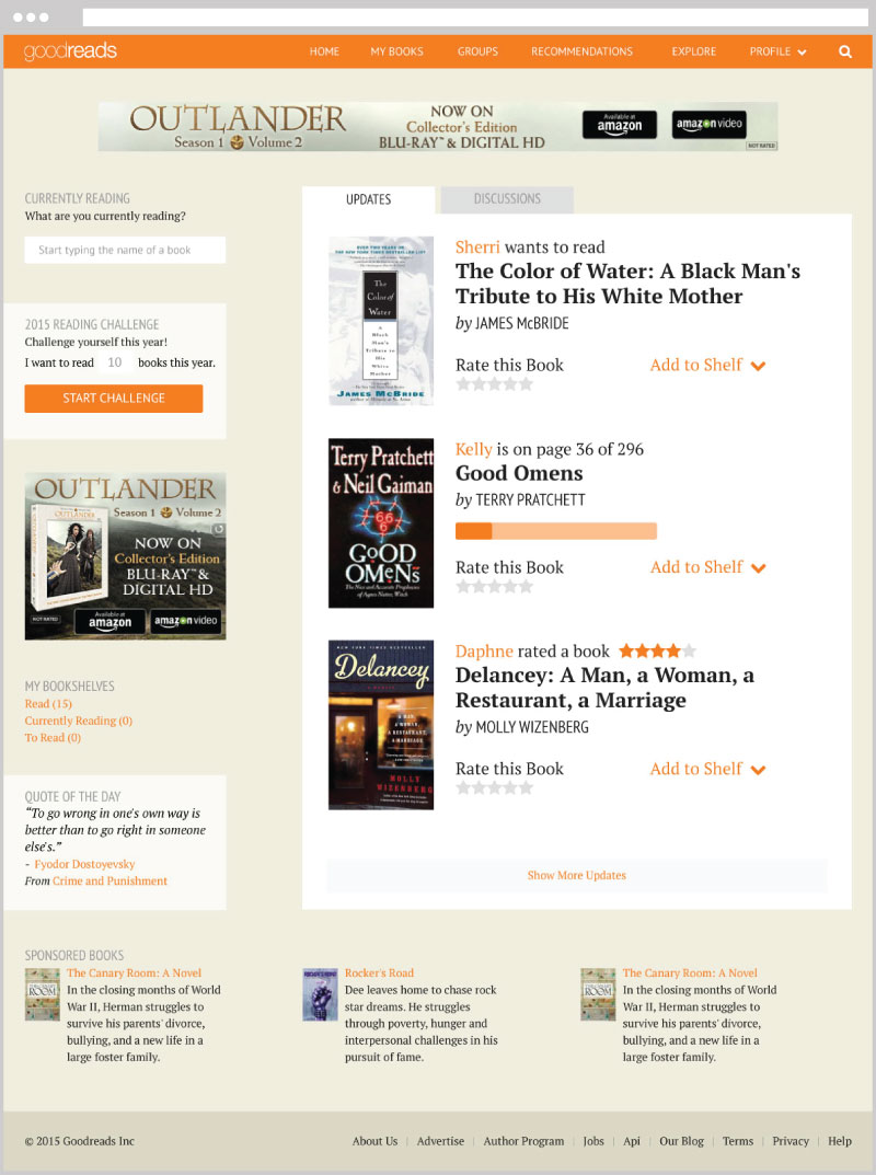
Project Description
GoodReads is a popular literary website where you can create reading lists, review and discuss titles and get suggestions for what to read next. For one of my UI Design projects at The Iron Yard, I was tasked with redesigning three pages of the site to be more organized and user friendly.
There were two main goals for the assignment:
- Gain experience working on a site with a lot of content
- Create a pixel perfect mockup using Adobe Illustrator
Organizing content took a considerable amount of time. Establishing heirarchy was crucial in organizing all the different elements on each page. Use of personas helped in making decisions about what features were most important and where they should be displayed.
Personas
For this project I created three user archetypes, or personas. Each represented a different type of GoodReads user, and each had a unique set of values and goals:
 Matilda, 23
- She's just out of college, so she's starting to read for fun again. She has an entry level marketing job. She wants to see what her friends are reading and what's popular in her favorite genres, and she has a goal of reading 30 books this year. She likes to read young adult fiction and in her free time she rides a unicycle.
 Jennifer, 36
- She has two kids and homeschools. She doesn't have much time to read, so she likes to use the site for recommendations and reviews (mostly from friends) and making lists. She likes historical fiction and has a Civil War crush.
 David, 42
- Single and middle aged, he works at a non-profit organization. He travels a lot for work, so he reads on the plane and in airports. He goes through books fairly quickly. He uses the site to keep track of what he's read, and to get recommendations for what he should read next. He enjoys reading nonfiction and biographies, and likes to play golf.