Prototyping
Plan. Build. Iterate.
The Marshmallow Challenge
Today at The Iron Yard we (the UI Design class) started our day with a challenge. A marshmallow challenge, to be specific. We were split up into groups and given twenty sticks of spaghetti, one yard of tape, one yard of string, and one marshmallow. Each group was then given eighteen minutes to build the tallest free-standing structure they could, with the marshmallow on top. Apparently this challenge divides participants into two categories: people who prototype, and people who don’t. My team oriented ourselves to the task, developed a plan of attack, and built a structure. We lost. You know who consistently does well at this challenge? Children in kindergarten. They build, then refine, then build again. Crazy.
Once the marshmallows had been put away, we talked about prototyping. It’s an interesting concept, all about designing something, testing it, and iterating it to make the best possible product. There are a few different means of prototype creation: paper, static, and fully functional. And of course there are variations of each. What’s great about all this is that it gets the product in the hands of the person who will actually be using it. And the feedback you get from this process is invaluable.

Project Details
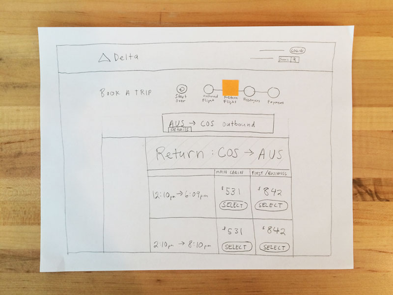
After our discussion we tried our hands at a little prototyping of our own. We were paired with a classmate and assigned an airline website. Our goal was to explore the site, find an interaction that we thought could use improvement, and make a paper prototype to be tested by our peers.
It didn’t take long for my partner and I to identify an interaction that was less than user-friendly. Surprisingly enough, we found the process for purchasing tickets to be quite confusing. The steps were not clearly labeled, so it was hard to know what was the next action to take. There was a progress bar at the top of the screen that we found a little misleading. At the start of the process it indicates there are a total of three steps. However, as you make your way through the process, additional steps appear (extras like checking extra bags and booking a car and/or hotel), making the whole ordeal longer. Plus, there was no way to go back a step, and if you tried to navigate back with the browser, you got sent back to the home page, and would have to start from the beginning again. Overall, the heirarchy of information is poor and there’s a lot of needless information vying for your attention.
Our Approach
We jotted down a handful of small fixes that could be implemented to organize the information better and make the “path of least resistance” a bit clearer. We only made one test model, though, so we limited implementation to two of our ideas.
Test Changes
- We made the progress bar at the top of the screen larger and included indicators for outbound and returning flights.
- We made each page’s heading text more prominent to help clarify progress status.
Results
Our results were quite good. We didn’t try to overhaul the whole process, we just tried to streamline the selection of tickets. I think the simplicity of our test worked well for us. One thing we noticed in the first test was that the progress indicator was still not apparent enough. Our tester was still able to complete their task easily and quickly, but they didn’t notice until after the test was over that the indicator was even there. For our second test we used small pieces of colored sticky notes to call attention to current progress, and received positive results.
In Summary
Looking back, we probably could have tested a more complicated interaction. Sure, it felt good to get good results. One of our testers even said, “I feel like I got something done!” But that was probably because we didn’t take the test through a complete task, from beginning to end. In the end, we learned something about prototyping, and that was the purpose. In the future we’ll know how to do it better. One more thing to look forward to.
Recent Posts
- My First Three Months at CROmetrics
- What The Criterion Collection Taught Me About Design
- Dear Startups, Stop Asking People to Work for Free
- Community
- CSS Crash Course
- Daily UI
- Simple Dynamic Navigation in Jekyll
- Designing for Mobile
- Prototyping
- Hackathon
- Personas
- CSS Zen Garden
- Accessibility
- Type Study
- A New Adventure
- Avoiding Jargon
- Fail Forward